
| Heading | Subheadings |
|---|---|
| Introduction | – Importance of mobile-first design |
| The Rise of Mobile Internet Usage | – Statistics on mobile usage |
| – Mobile vs. Desktop internet access trends | |
| Understanding Mobile-First Design | – Definition and principles |
| – Differences between mobile-first and responsive design | |
| Benefits of a Mobile-First Approach | – Improved user experience |
| – Enhanced SEO rankings | |
| – Faster website load times | |
| – Increased conversion rates | |
| Mobile-First and SEO: A Synergistic Relationship | – Mobile-first indexing by search engines |
| – SEO advantages of mobile-first designs | |
| User Experience (UX) in the Mobile-First Era | – Designing for touch interactions |
| – Prioritizing content and functionalities | |
| Technical Aspects of Mobile-First Design | – Adaptive vs. responsive images |
| – Utilizing mobile-first CSS and frameworks | |
| Challenges in Adopting a Mobile-First Approach | – Overcoming design limitations |
| – Ensuring compatibility across devices | |
| Real-World Success Stories | – Case studies of businesses benefiting from mobile-first approach |
| How to Implement a Mobile-First Strategy | – Planning and research |
| – Design and development phases | |
| Future Trends in Mobile-First Design | – Advances in technology and design practices |
| – The role of AI and machine learning | |
| Why I Should Consider a Mobile-First Approach | – Recap of key points |
| FAQs | – Common questions and answers |
| Conclusion | – Final thoughts and call to action |
Why I Should Consider a Mobile-First Approach on My Next Website
In an era where smartphones have become an extension of ourselves, the importance of designing websites with a mobile-first approach cannot be overstated. This article explores the pivotal reasons why prioritizing mobile design is not just a trend but a necessity for any forward-thinking web design business in Texas.
The Rise of Mobile Internet Usage
The shift towards mobile internet usage is undeniable. With over half of global web traffic now coming from mobile devices, it’s clear that consumers prefer the convenience of accessing information on the go. This transition from desktop to mobile demands a change in how websites are designed, making mobile-first design an essential strategy for reaching your audience effectively.
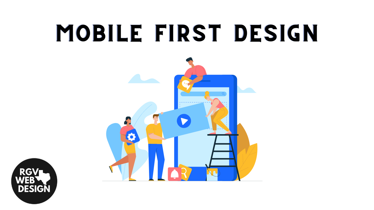
Understanding Mobile-First Design
At its core, mobile-first design means creating an online experience for mobile devices before designing for desktop or any other larger screens. This approach is rooted in simplicity, focusing on essential features and content that meet the user’s immediate needs, without the clutter. Unlike responsive design, which often starts with a desktop site and scales down, mobile-first design ensures that your site is optimized for mobile users from the ground up.
Benefits of a Mobile-First Approach
Improved User Experience: Mobile-first websites are designed for the constraints and advantages of mobile devices, offering a smoother and more intuitive user experience. This user-centric approach can significantly enhance satisfaction and engagement.
Enhanced SEO Rankings: Google’s mobile-first indexing prioritizes mobile versions of websites for ranking purposes. By adopting a mobile-first approach, you’re aligning with Google’s guidelines, improving your site’s visibility in search results.
Faster Website Load Times: Mobile-first designs tend to be leaner with optimized images and assets, leading to quicker load times. Faster websites reduce bounce rates and encourage users to stay longer, exploring what you have to offer.
Increased Conversion Rates: A seamless mobile experience can directly impact your conversion rates. Mobile users are more likely to take action when faced with simple navigation and clear calls-to-action designed for smaller screens.
Mobile-First and SEO: A Synergistic Relationship
The relationship between mobile-first design and SEO is a powerful one. With search engines like Google placing significant emphasis on the mobile experience, a mobile-first website is a step ahead in the SEO game. This approach ensures that your site is not only user-friendly but also search engine friendly.
User Experience (UX) in the Mobile-First Era
Creating a compelling mobile user experience requires understanding how people use their mobile devices. This involves designing for touch interactions and prioritizing content to match the user’s intent and context. A well-executed mobile-first design considers all these factors to deliver a UX that feels natural and effortless.
Technical Aspects of Mobile-First Design
Implementing a mobile-first design involves technical considerations, such as choosing the right CSS frameworks and optimizing images for mobile. These elements are crucial for ensuring that your website not only looks great on mobile devices but also operates smoothly and efficiently.
Challenges in Adopting a Mobile-First Approach
While the benefits are clear, transitioning to a mobile-first design can present challenges. These include navigating design constraints and ensuring a consistent experience across various devices. However, with careful planning and execution, these hurdles can be overcome, paving the way for a successful mobile-first website.
Real-World Success Stories
Many businesses have reaped significant rewards by adopting a mobile-first approach. From increased traffic and higher engagement rates to improved conversion rates, the success stories are both inspiring and telling of the approach’s effectiveness.
How to Implement a Mobile-First Strategy
Adopting a mobile-first approach requires a shift in mindset and methodology. Starting with thorough planning and research, followed by a design and development phase that prioritizes mobile considerations, is key to successful implementation.
Future Trends in Mobile-First Design
As technology continues to evolve, so too will mobile-first design practices. Advances in AI, machine learning, and design tools are expected to further enhance the capabilities and efficiency of mobile-first websites, ensuring they remain at the forefront of digital strategy.
Why I Should Consider a Mobile-First Approach
In conclusion, the mobile-first approach is not just a design choice; it’s a strategic business decision that aligns with current trends and consumer behaviors. By focusing on mobile users from the outset, you’re ensuring that your website is accessible, engaging, and effective in meeting the needs of your audience, ultimately driving growth and success.
FAQs
How does mobile-first design differ from responsive design?
Why is mobile-first important for SEO?
What are the key elements of a mobile-first website?
How can I ensure my mobile-first site is user-friendly?
Can a mobile-first approach improve my website’s conversion rates?
What tools can help in implementing a mobile-first design?
Conclusion
Embracing a mobile-first approach in your next website project is not just keeping up with the times; it’s about setting the stage for future success. By prioritizing the mobile experience, you’re investing in a strategy that meets your audience where they are most active, enhancing engagement, SEO, and conversions. The mobile-first era is here to stay, and adapting to it is not just advisable—it’s imperative for any Texas web design business looking to thrive in the digital age.
References
- Google Mobile-First Indexing: For insights into Google’s mobile-first indexing and its implications for SEO, visit the official Google Webmasters Blog.
- Mobile Internet Usage Statistics: To understand the current trends and statistics in mobile internet usage, check out Statista, which offers up-to-date data on mobile vs. desktop internet access.
- Responsive Web Design vs. Mobile-First Approach: For a deeper comparison between responsive web design and mobile-first approaches, Smashing Magazine provides comprehensive articles and guides on the subject.
- Optimizing Images for Mobile Devices: Learn how to optimize images for mobile devices with best practices from MDN Web Docs, a trusted resource for web developers.
- Mobile-First CSS Frameworks: For those interested in mobile-first CSS frameworks, Bootstrap offers extensive documentation and examples to help developers design mobile-first websites.
- Designing for Touch Interactions: To better understand designing for touch interactions, Nielsen Norman Group offers insights into usability and user experience for mobile devices.
- SEO Advantages of Mobile-First Design: For more information on how mobile-first design influences SEO, Search Engine Journal is a valuable resource for the latest SEO strategies and trends.